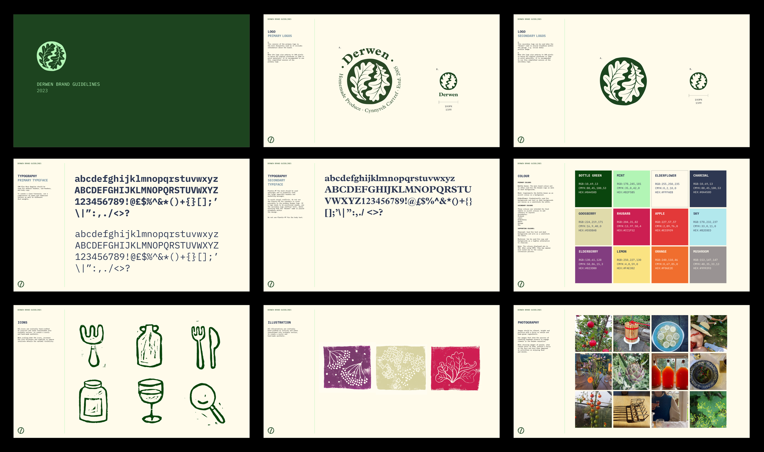
Derwen
Branding & Identity, Illustration
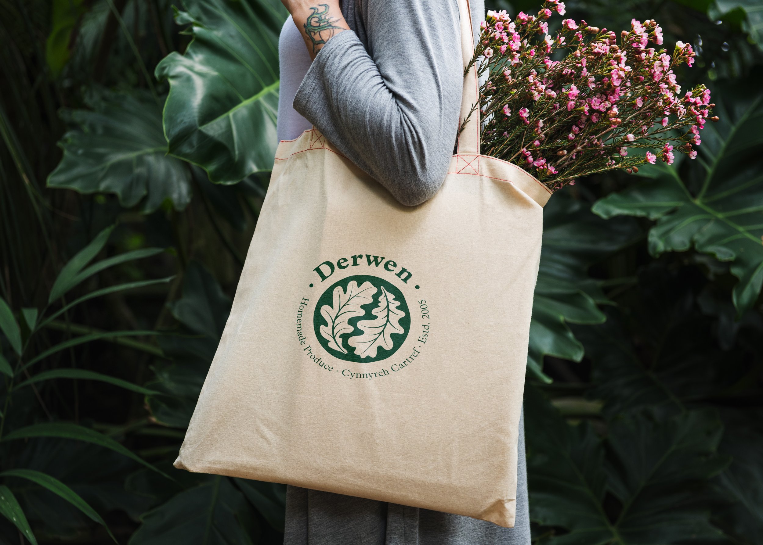
An identity created for ‘Derwen’ (‘Oak’ in Welsh), a brand dedicated to homemade produce.
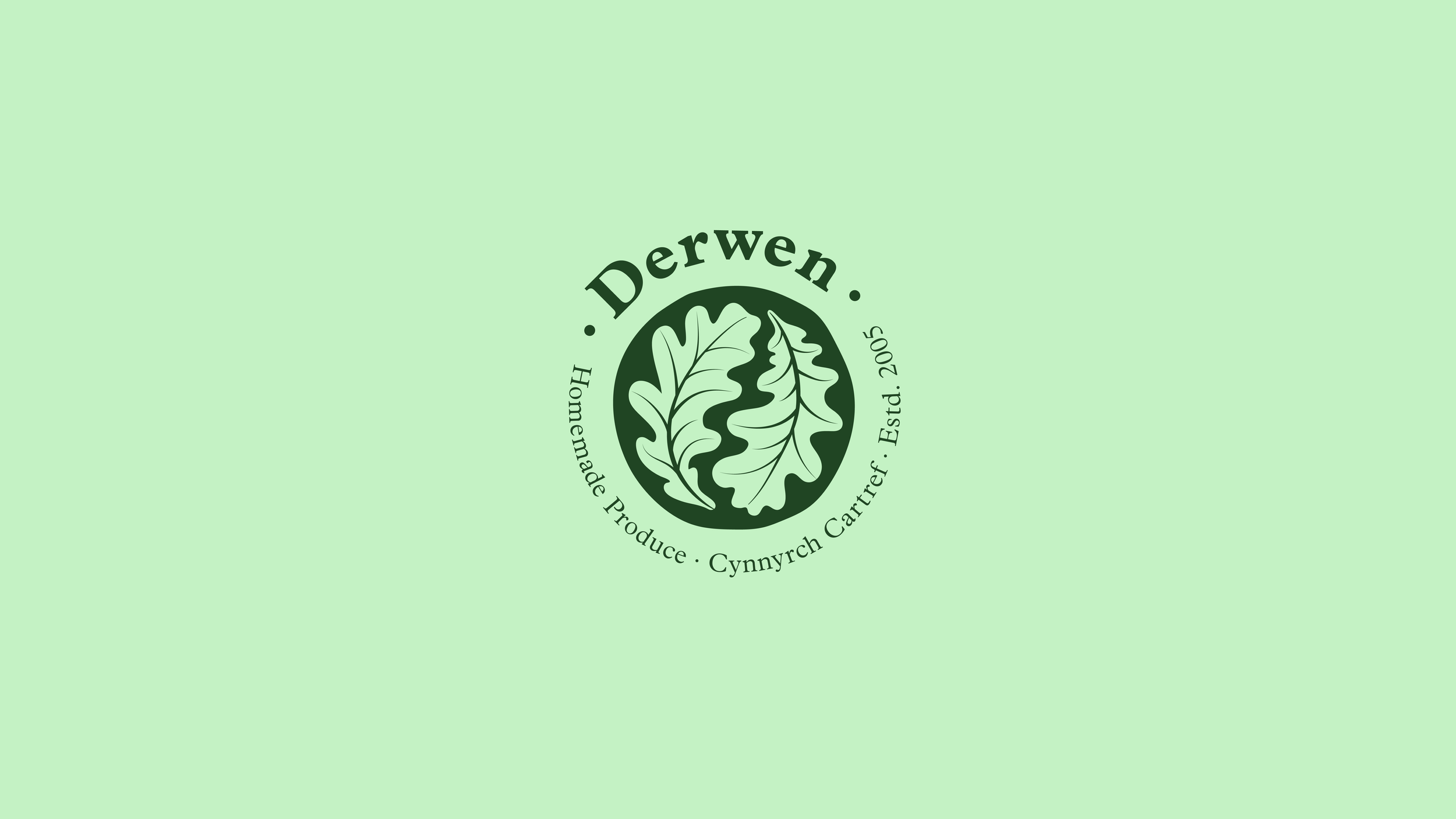
I crafted this brand identity for Helen, whose love for creating homemade produce has played an important part in her family life since she can remember. Drawing inspiration from the large oak tree standing next to her Victorian home in North Wales, she named the brand ‘Derwen’ which Oak in Welsh. She asked me to create a brand that could be applied to her food and wine products for both print and digital mediums.
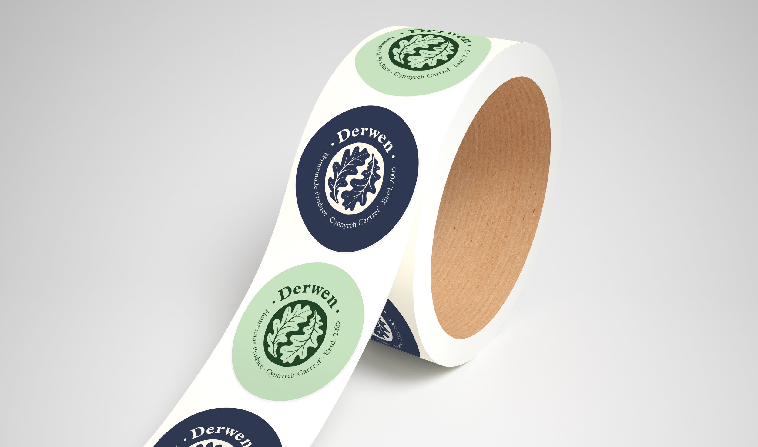
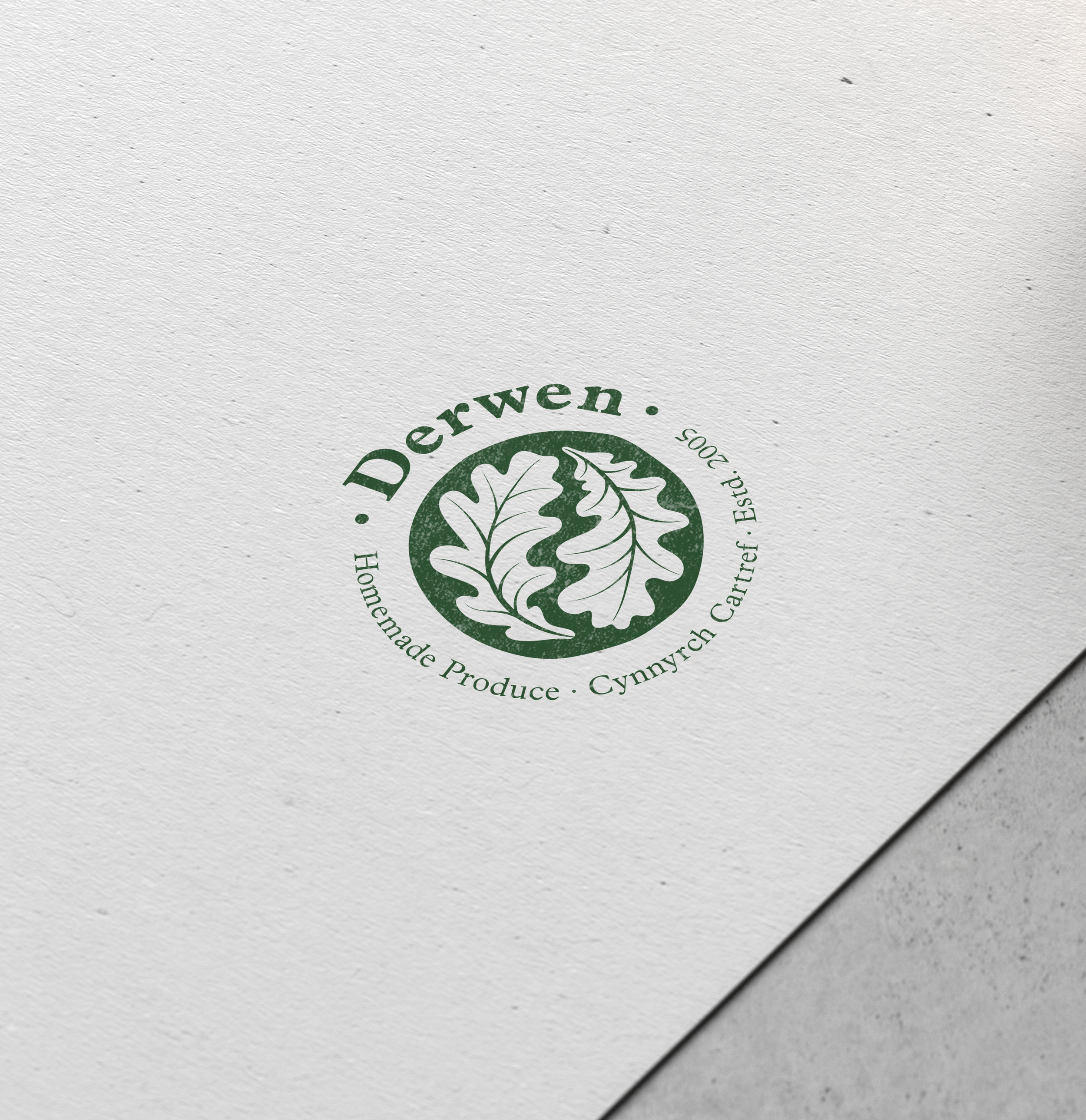
The logo design captures the essence of the brand's handcrafted nature, with the imperfect circle intentionally drawn with organic edges to reflect the rustic charm of homemade produce. The traditional typeface featured in the design suits the traditional cooking methods used as well as suiting the old Victorian house setting.
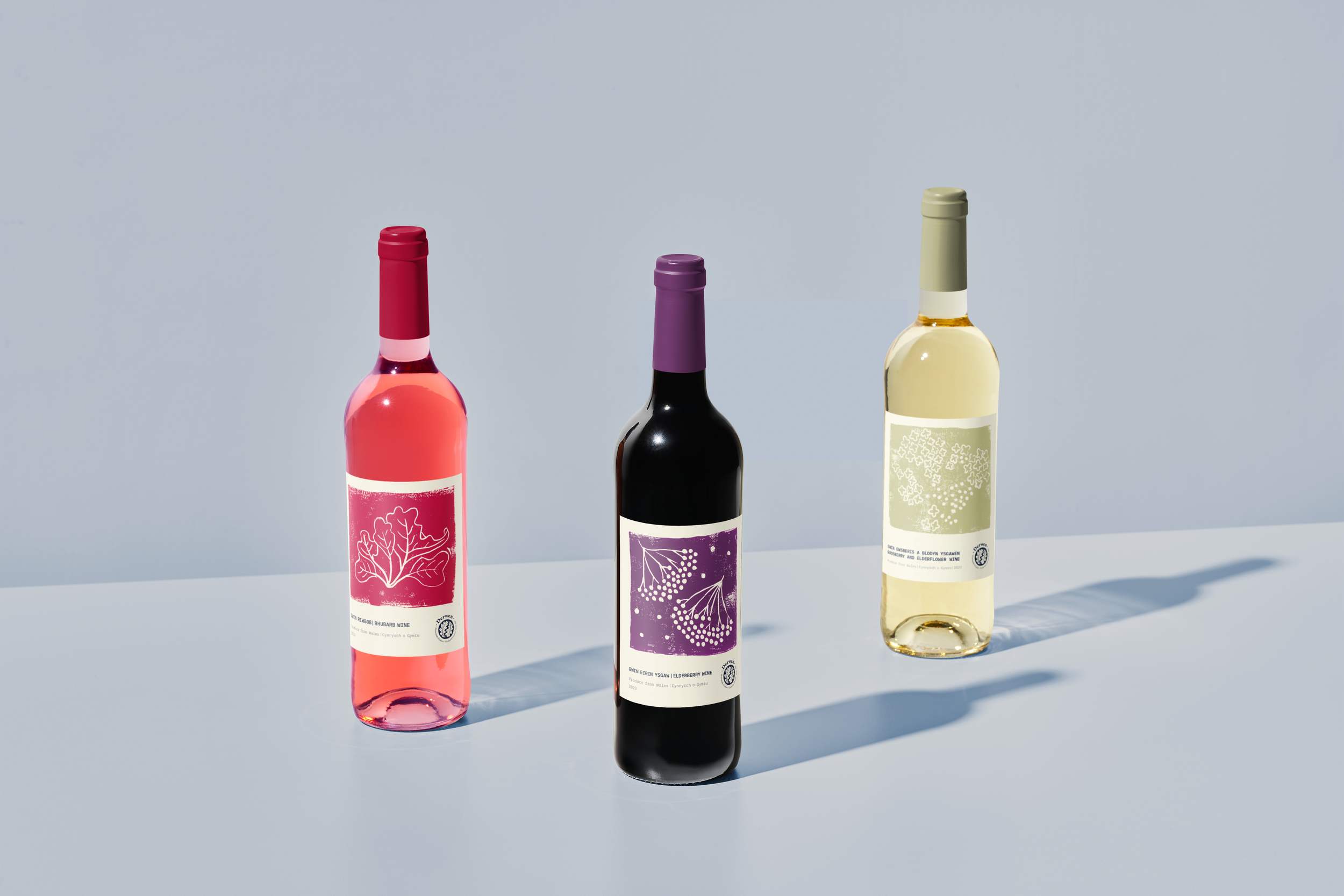
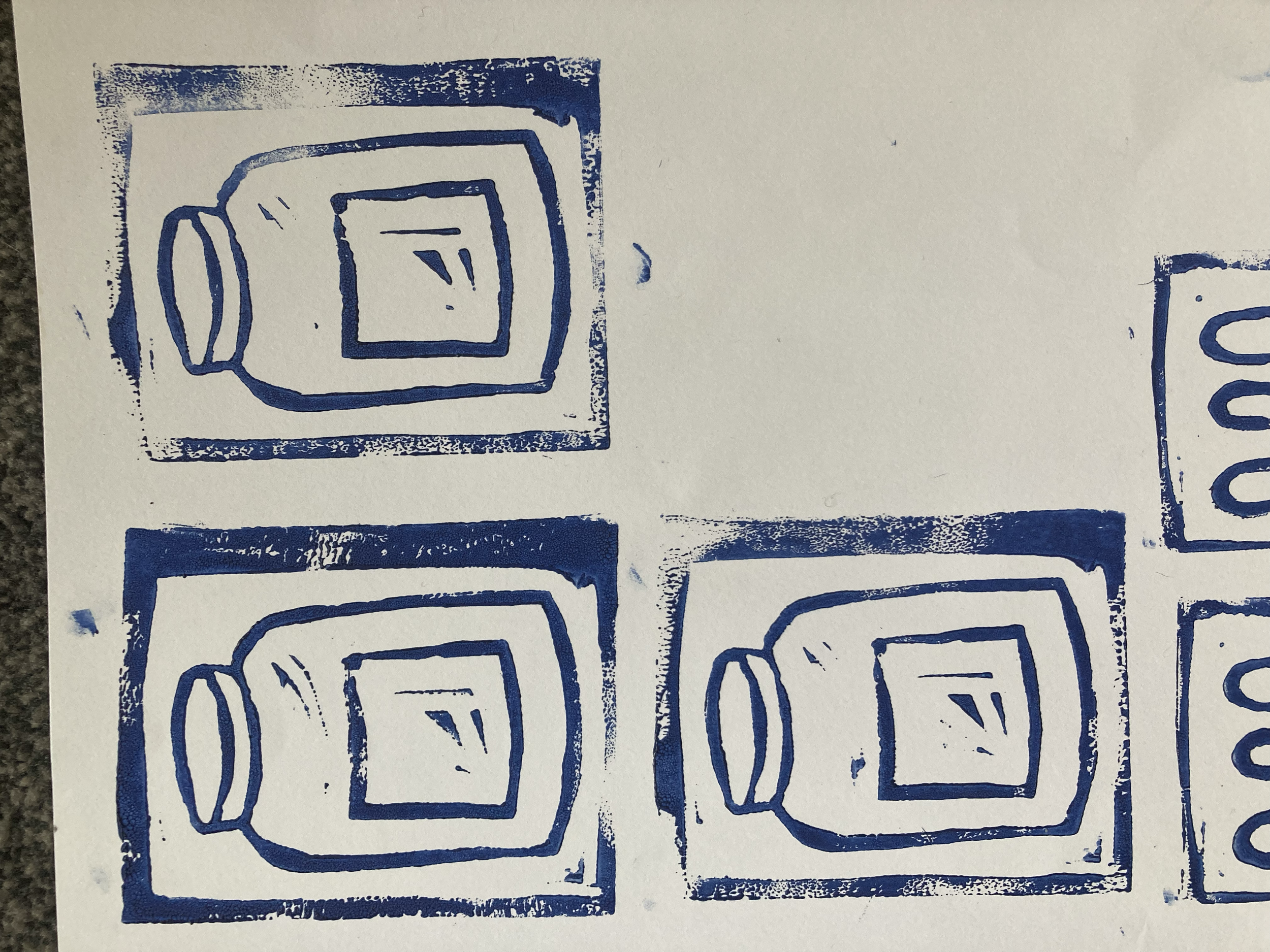
I designed some labels for her wine using linocut imagery with the use of colours inspired by the ingredients, paired with a typewriter styled font. I wanted the labels to look like they’d completely been made by hand, using home printing techniques and a manual typewriter.
![Derwen Wine Labels [Recovered]_v3-03.png](https://images.squarespace-cdn.com/content/v1/60045a0d4616fd2204d5acea/90886fa6-bc30-4a4a-97bd-c66e8b372c9f/Derwen+Wine+Labels+%5BRecovered%5D_v3-03.png)
![Derwen Wine Labels [Recovered]_v3-02.png](https://images.squarespace-cdn.com/content/v1/60045a0d4616fd2204d5acea/3d852426-96c0-47bd-b6e0-93cd62ffe537/Derwen+Wine+Labels+%5BRecovered%5D_v3-02.png)
![Derwen Wine Labels [Recovered]_v3-04.png](https://images.squarespace-cdn.com/content/v1/60045a0d4616fd2204d5acea/d5e5ee5a-02e7-4b81-a540-07f8ee2de708/Derwen+Wine+Labels+%5BRecovered%5D_v3-04.png)
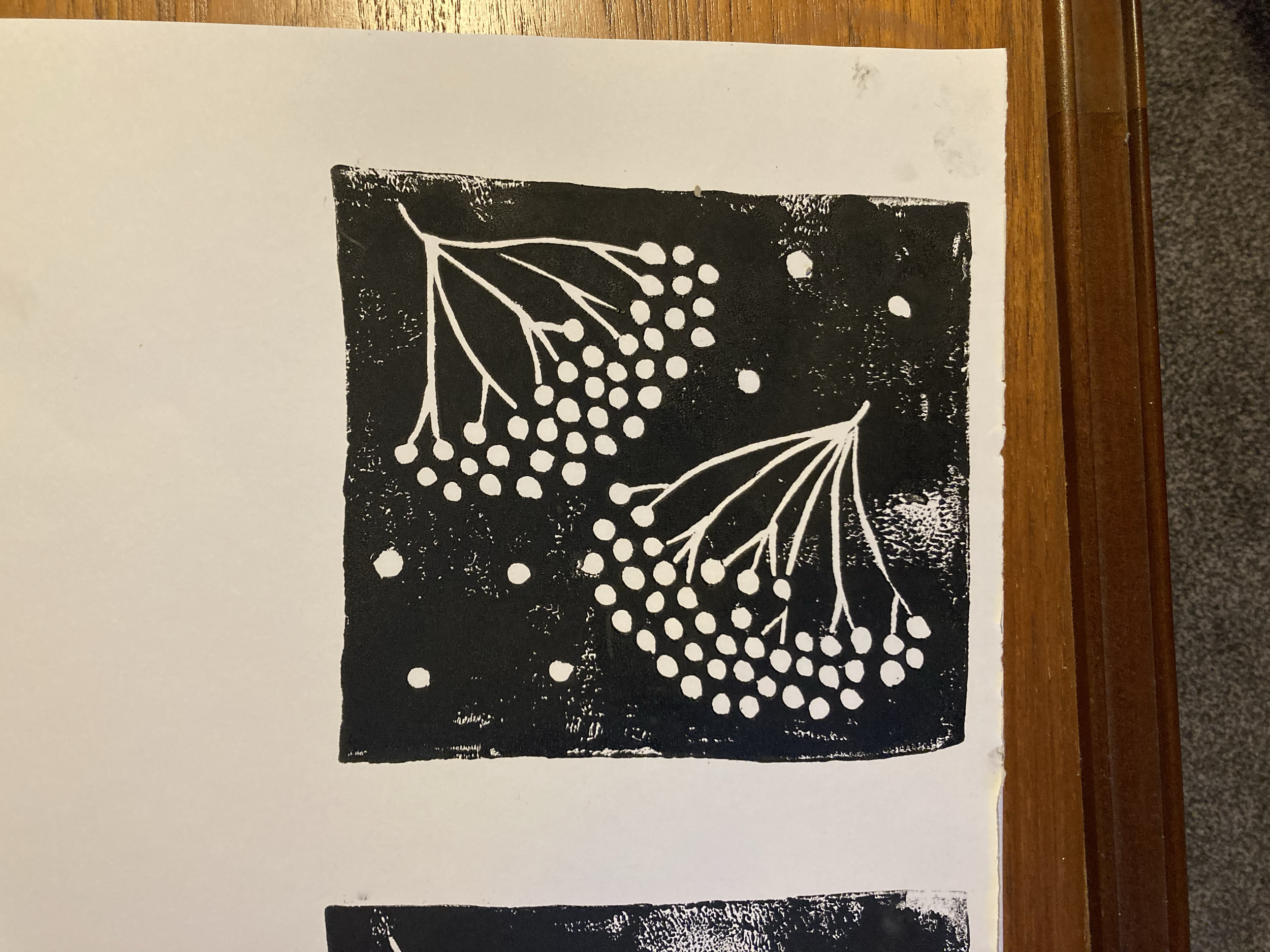
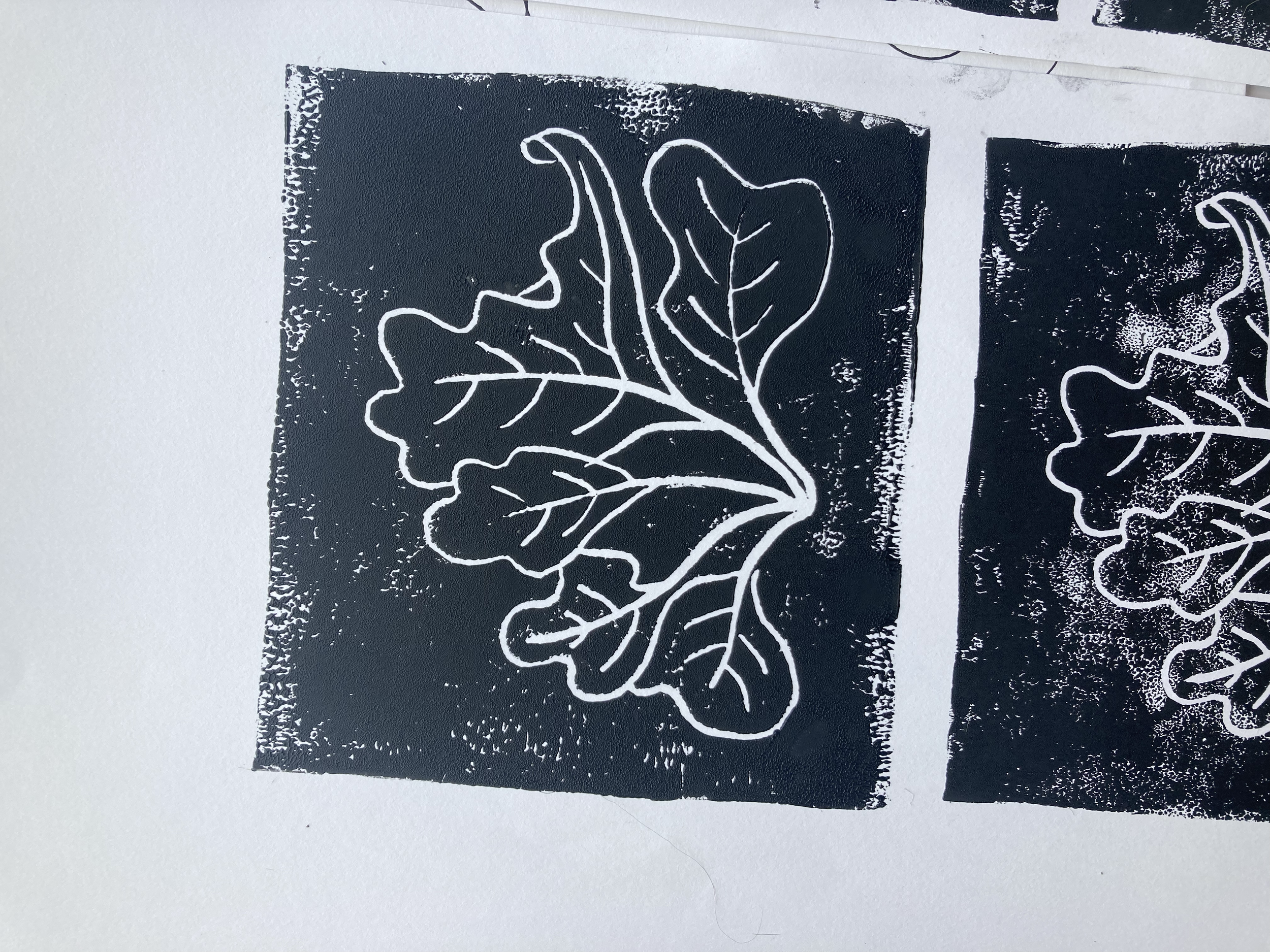
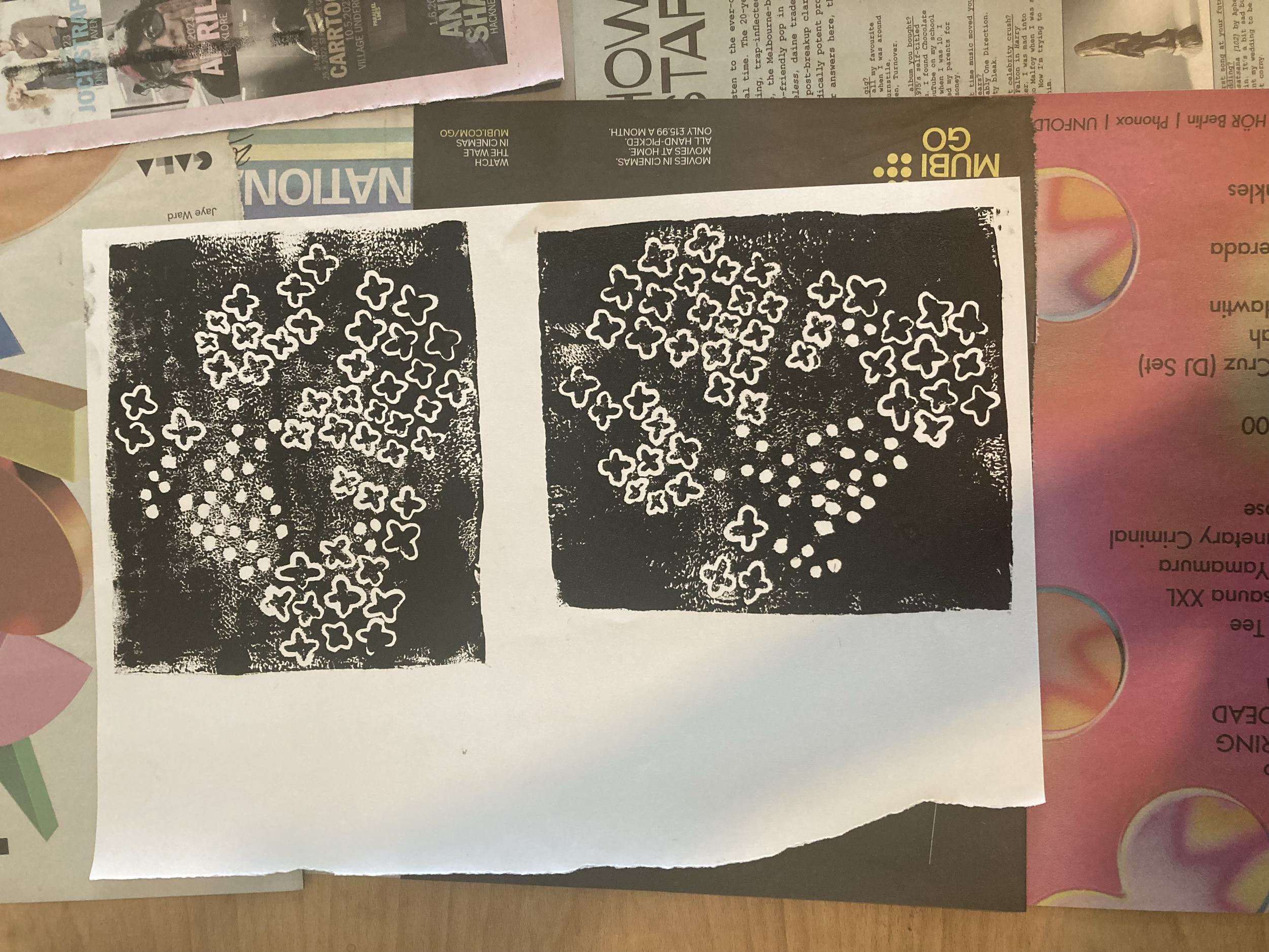
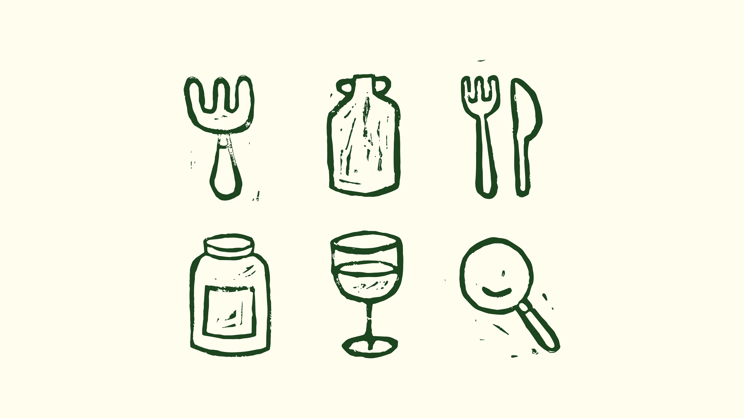
I produced a set of icons by creating linocuts by hand, scanning them in and turning them into vectors digitally.